Crafting a Global Identity
Mccoy is an animation and post-production company based in Jaipur, India, with a wide range of services from asset development to feature film animation. As part of their growth strategy, they needed a complete brand refresh. The primary objective was to create a new brand identity that would help them be recognized as a premier, creative, and progressive animation company on a global scale. The challenge was to design a logo and visual system that felt playful yet professional, embodying the core principles of animation itself.
Embedding Motion into the Mark
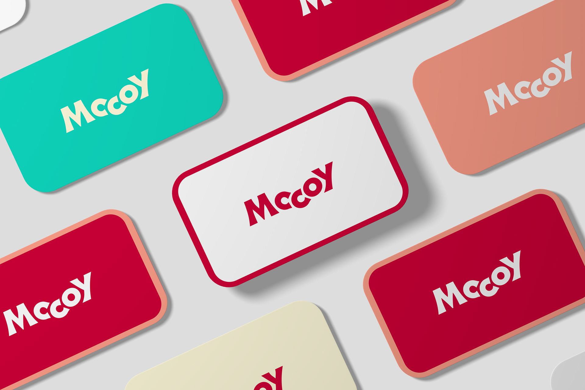
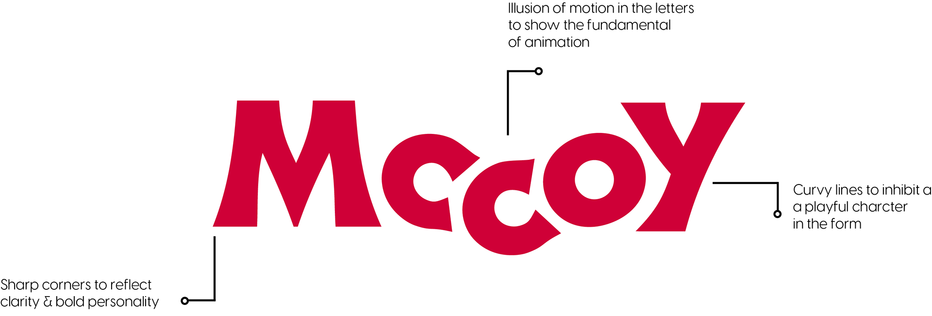
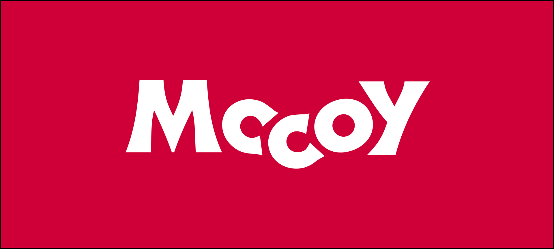
The solution was a bold, typography-based logo designed to create an "illusion of motion". The letters are crafted to look like they are following each other, creating a rhythmic movement that captures the viewer's attention and represents the essence of animation. This typographic approach ensures the brand name is imprinted in the minds of viewers, while its unique form makes it memorable and versatile.
The Brand Identity System
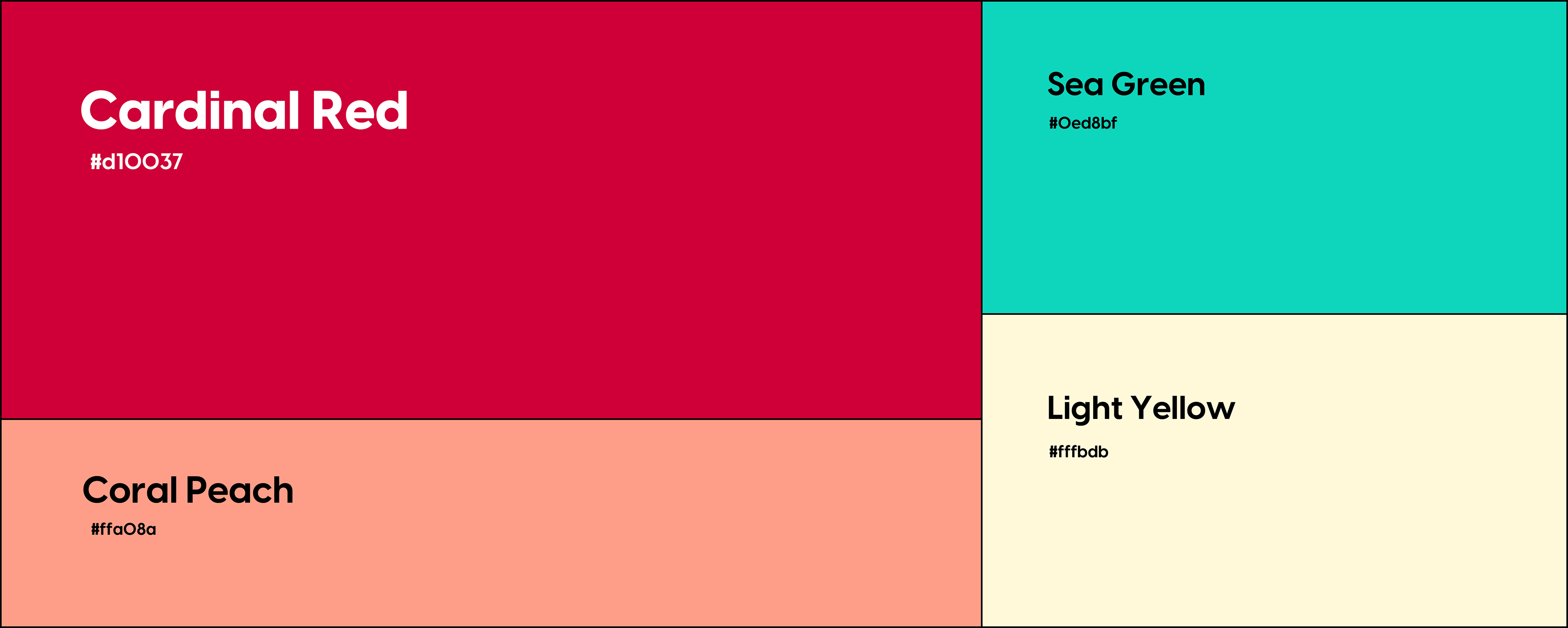
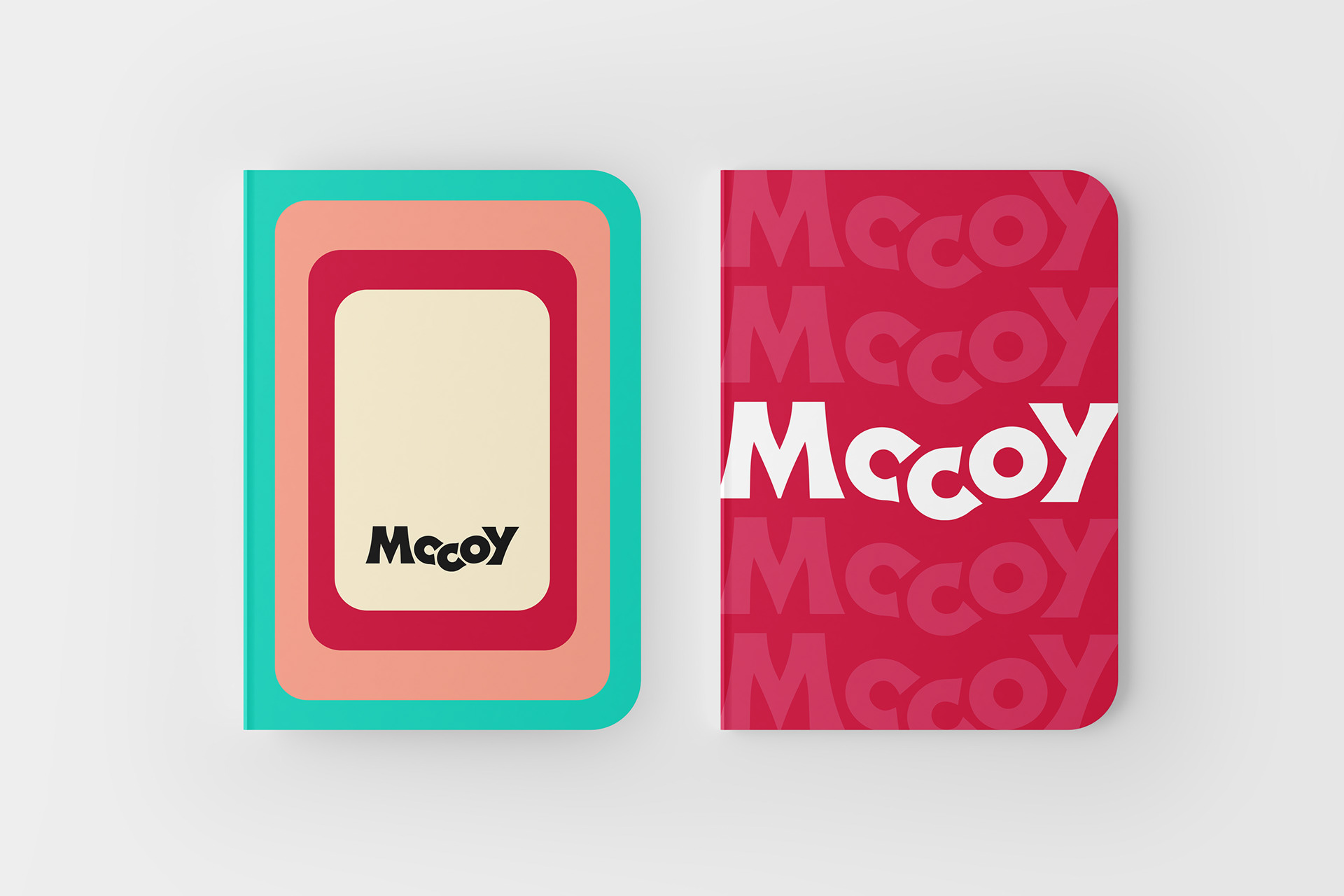
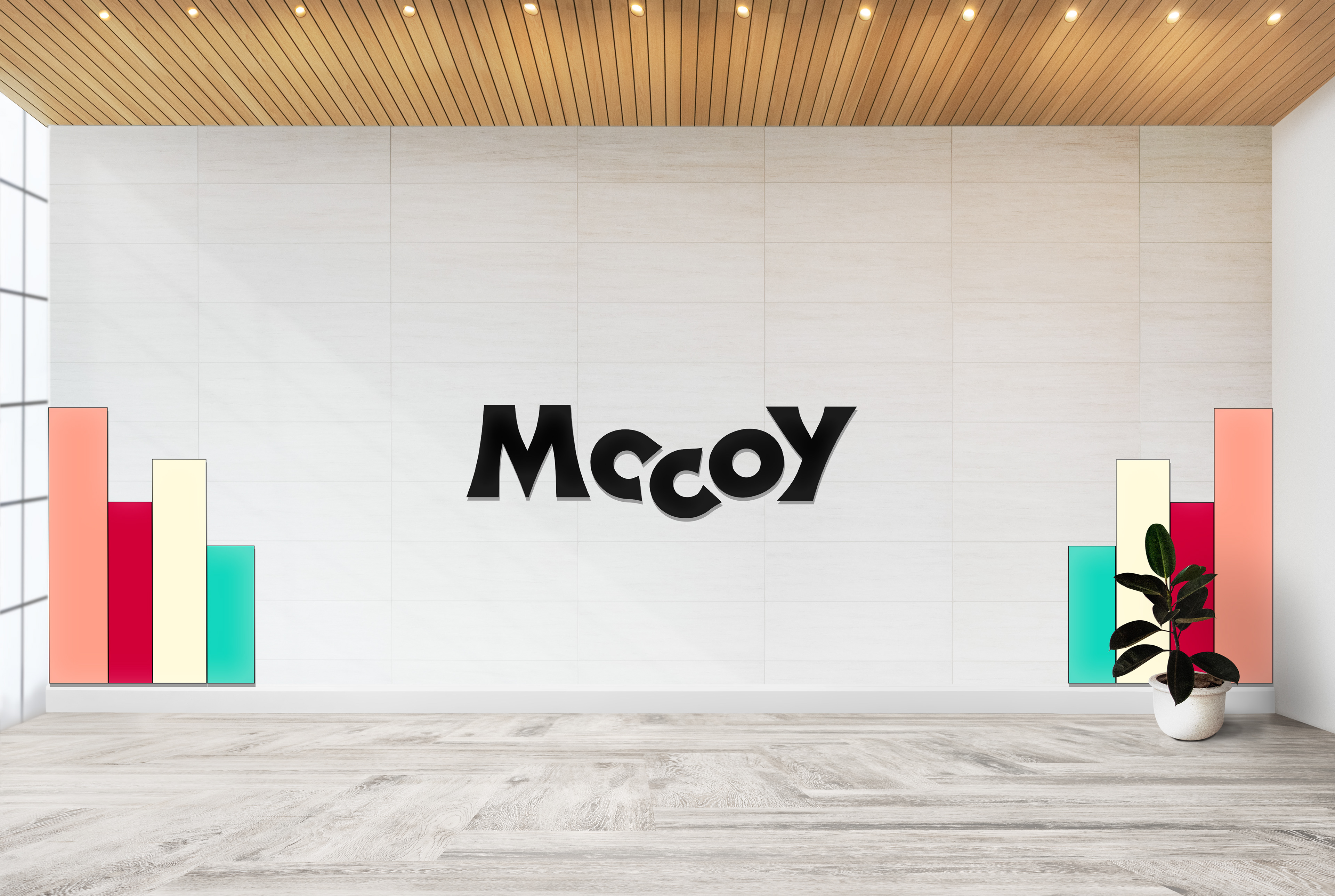
Color Palette A complimentary color scheme was developed to be vibrant and appealing. The primary Cardinal Red (#d10037) is bold and energetic, while the secondary Sea Green (#0ed8bf) enhances its impact. The palette is expanded with pastel hues like Coral Peach and Light Yellow to allow for greater creative flexibility in application.
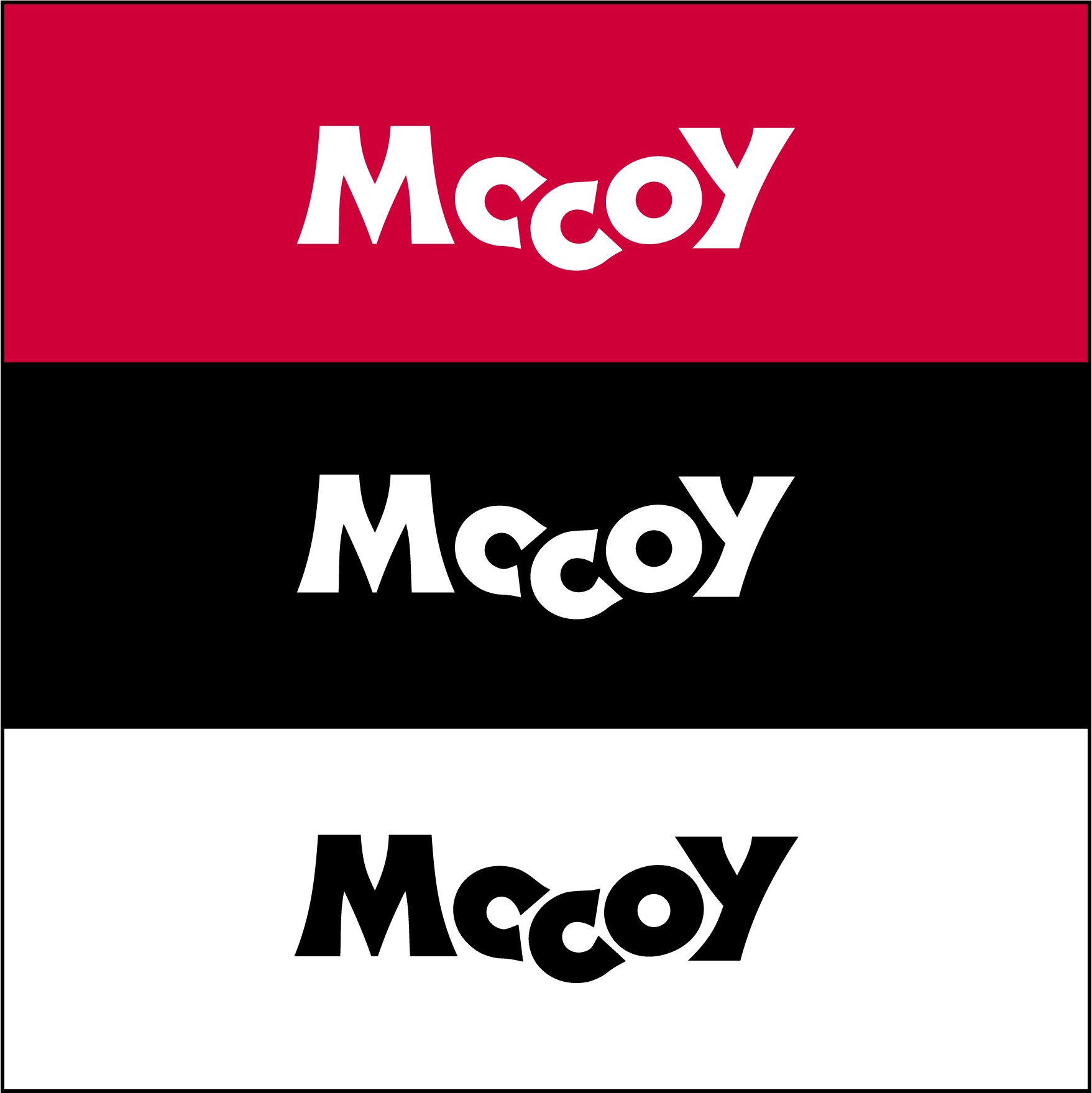
Logo Functionality
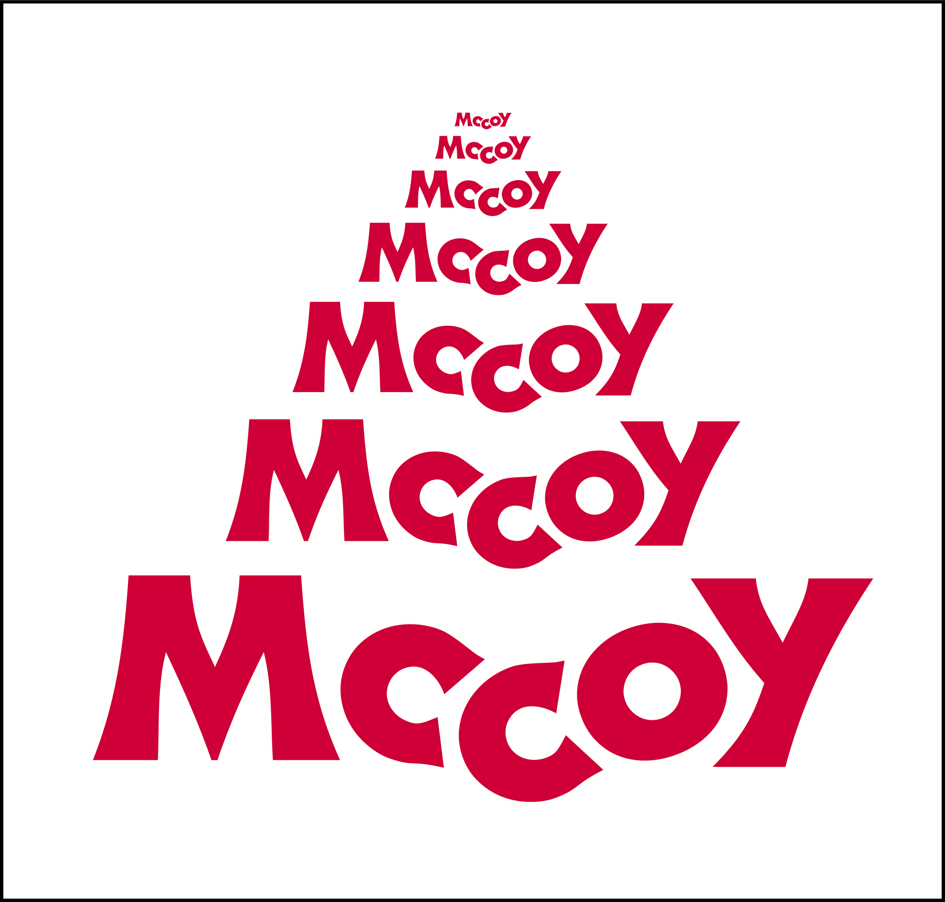
The clear form of the logo makes it functional in all sizes and colors. It can be used for various applications without compromising its visibility and clarity.
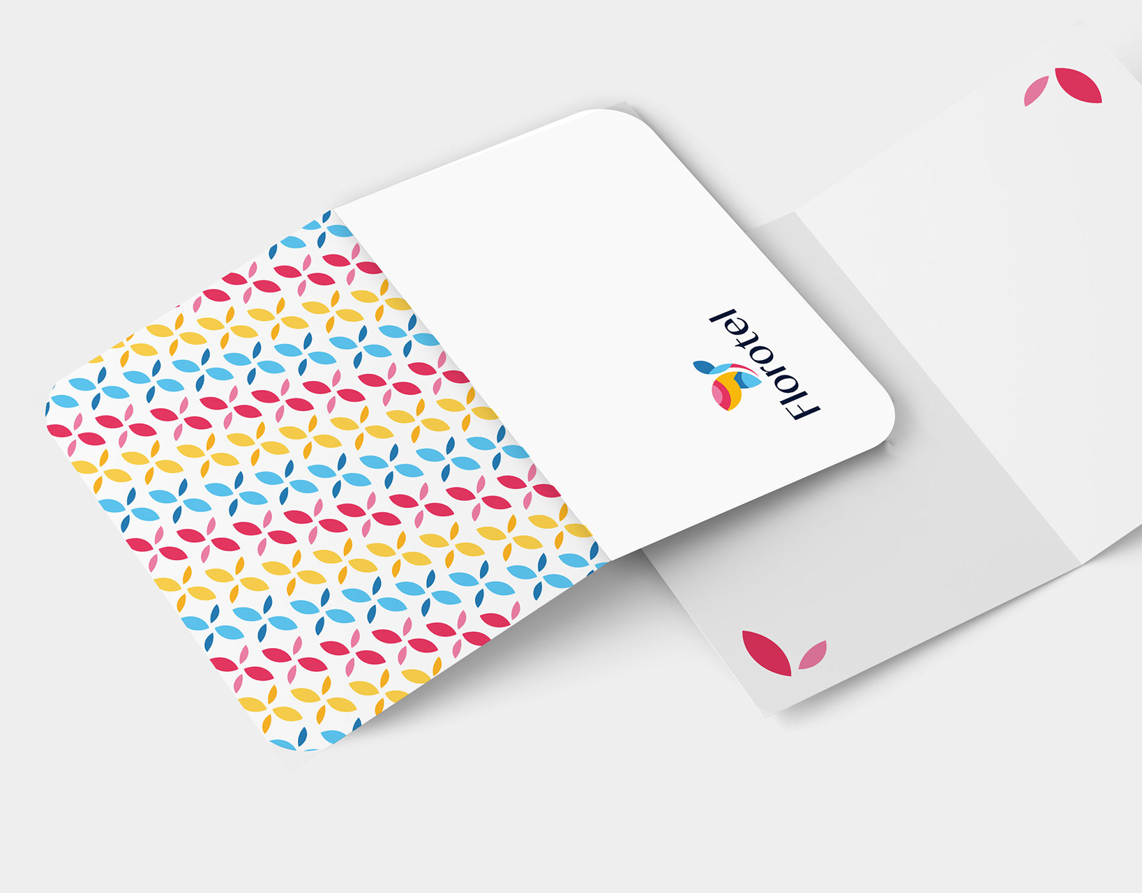
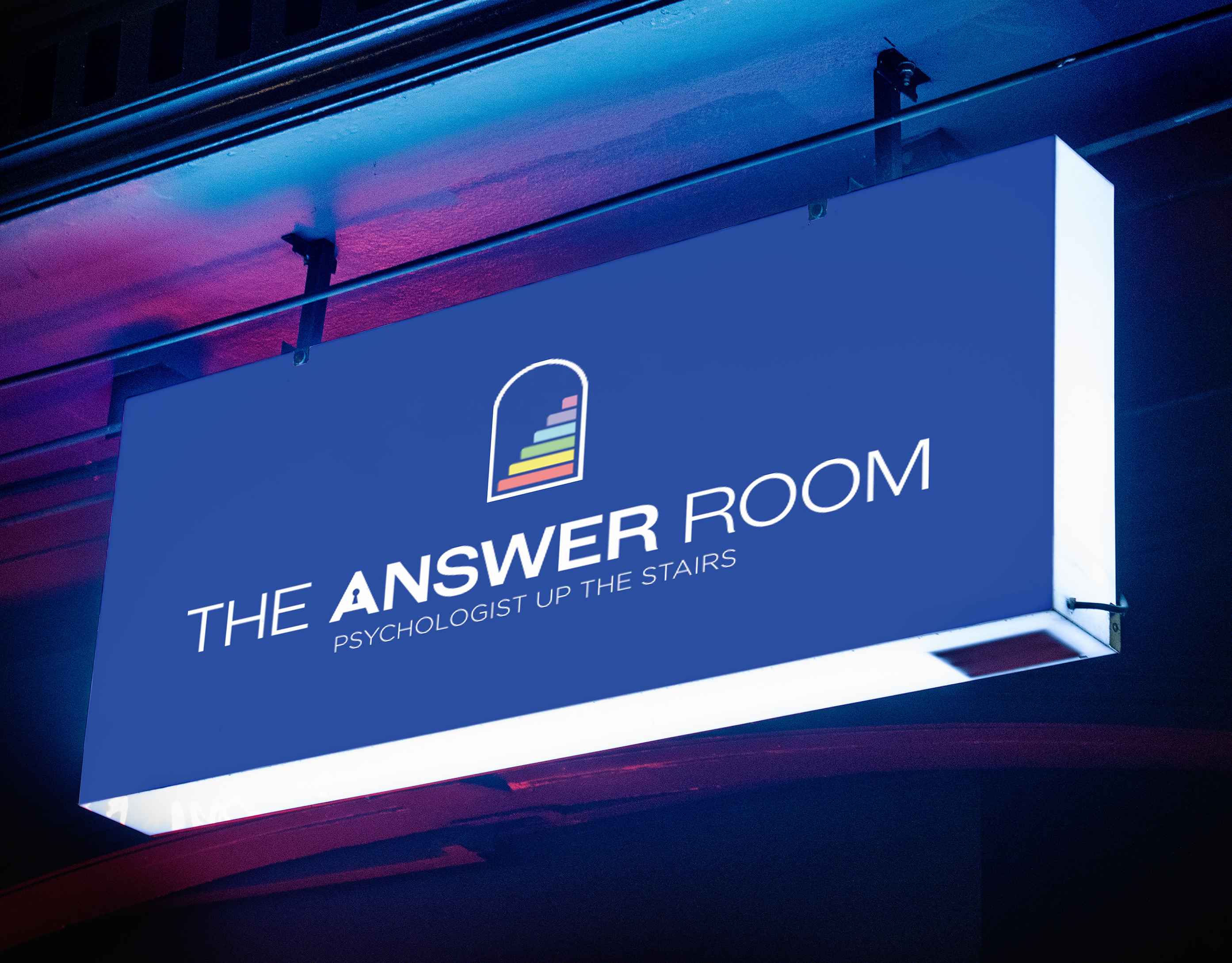
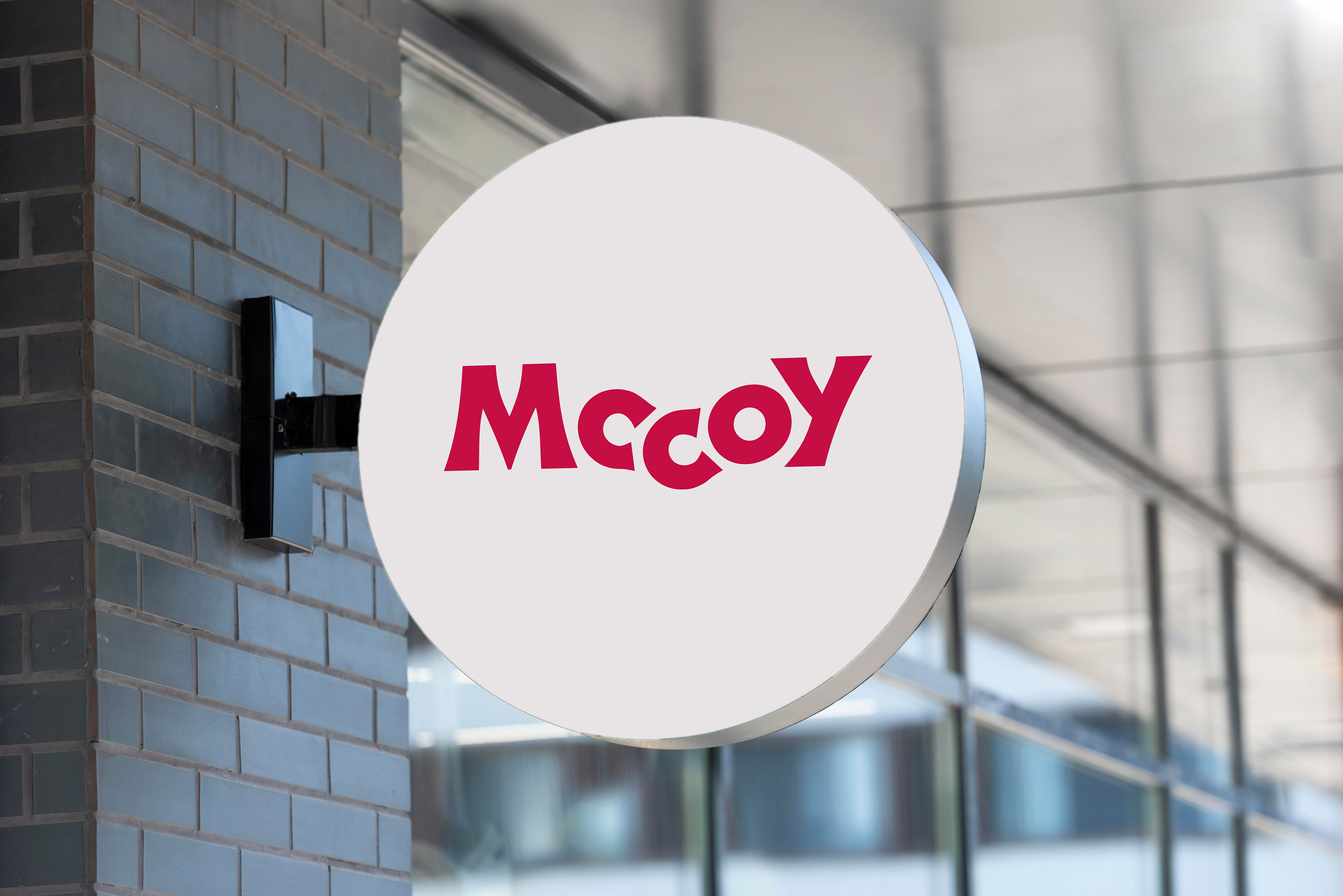
A Versatile Identity in Action
Here are some examples of how the new branding comes to life across various touchpoints.

Client
Mccoy Animation & Post Production
Agency
Bluewave Media
My Role
Lead Graphic Designer
Project Scope
Brand Strategy l Logo Redesign l Visual Identity System
Year
2022
Softwares Used
Adobe Illustrator l Adobe Photoshop