A Fresh Identity for the Modern Traveler
Florotel is a new chain of boutique hotels aiming to provide a unique, vibrant, and comfortable experience. They required a complete brand identity from the ground up that would feel both luxurious and welcoming. The challenge was to create a flexible visual system that could be applied consistently across a vast range of items—from large-scale signage to small in-room amenities—while establishing a memorable brand presence that could stand out in the competitive hospitality industry.

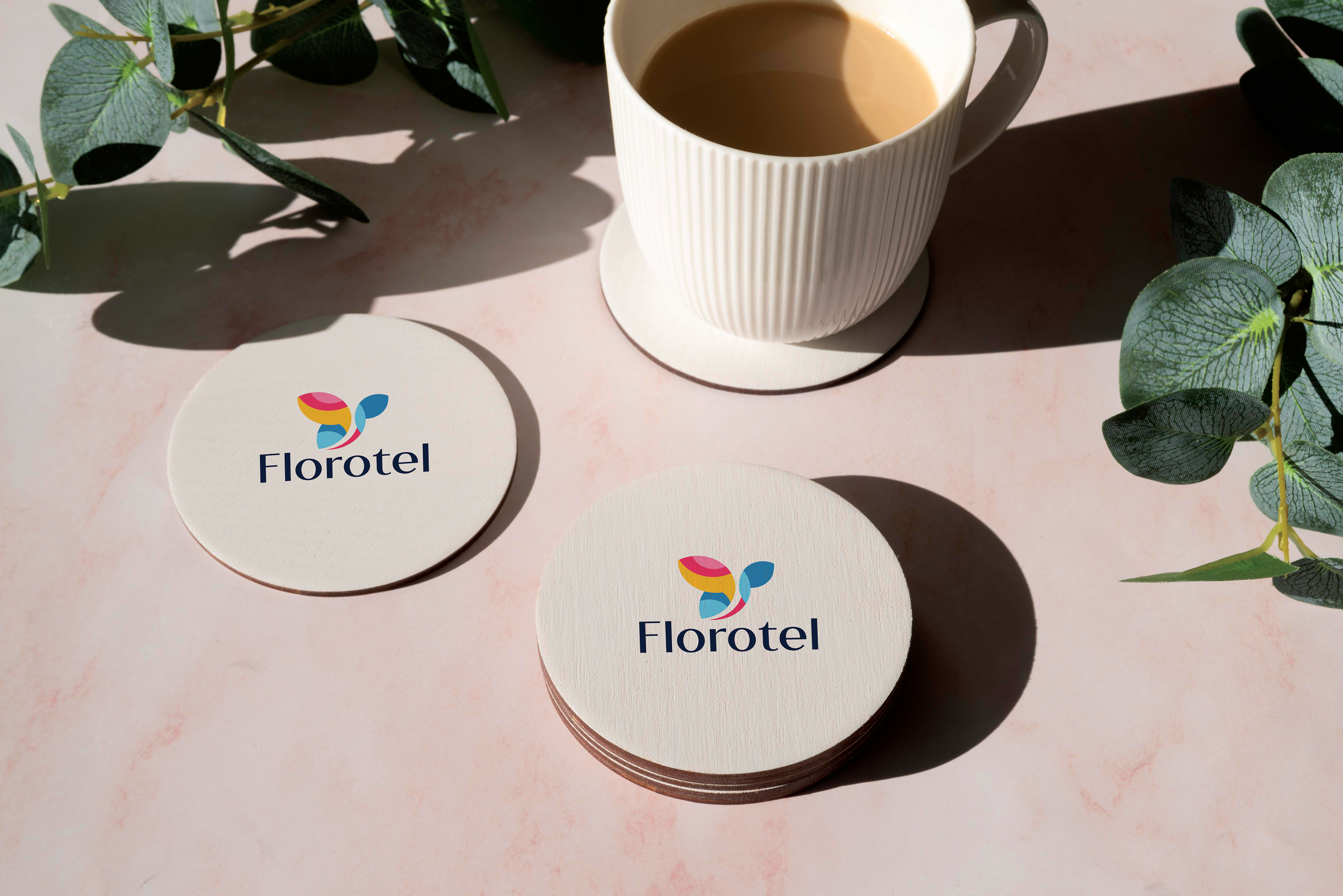
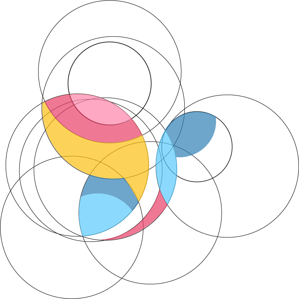
The Welcoming Butterfly
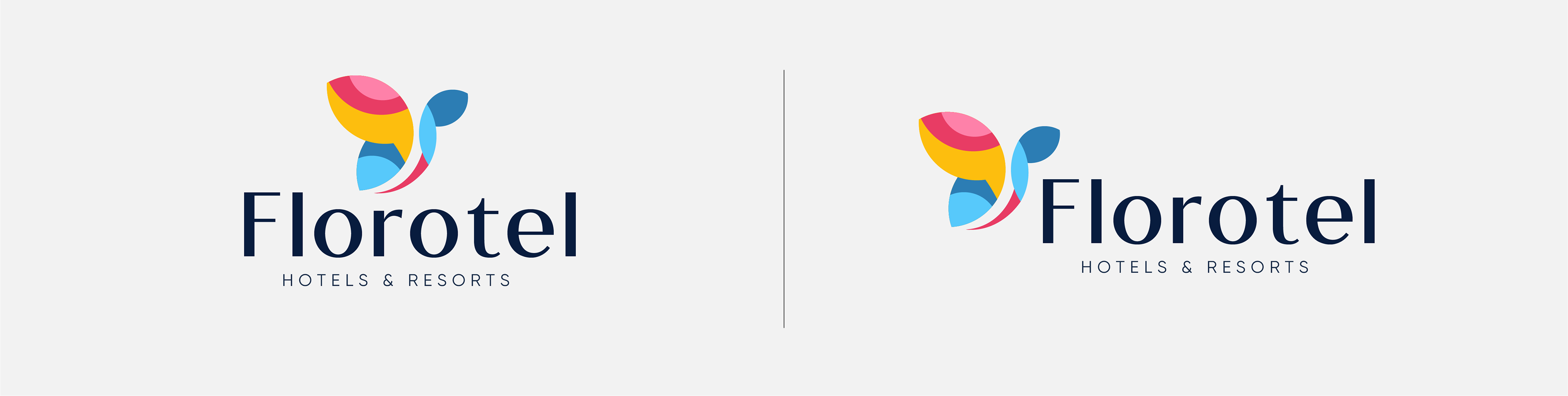
The name "Florotel" suggests a connection to nature and flora. The solution was a logo centered around an abstract, butterfly-like mark. The butterfly symbolizes transformation, beauty, and warmth, perfectly aligning with the welcoming experience of a boutique hotel. The mark itself is constructed using the principles of the golden ratio, built from a series of perfect circles to create a final form that is balanced, organic, and aesthetically pleasing. This geometric foundation ensures the logo is professional and timeless, while its vibrant colors bring energy and life to the brand.


The Brand Identity System
The Florotel visual identity is built on a foundation of elegant geometry, a vibrant color palette, and clean typography, all working together to create a welcoming and sophisticated guest experience. The abstract butterfly-like mark is constructed using a series of overlapping circles, adhering to geometric principles to create a form that is balanced, organic, and visually pleasing. This gives the logo a timeless and well-crafted feel.

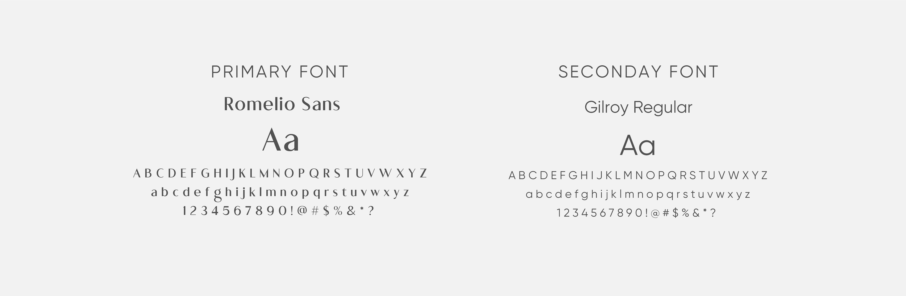
Color Palette & Typography

Brand Pattern

Crafting Every Touchpoint
The strength of the Florotel brand lies in its consistent and thoughtful application across every point of the guest journey, from the first welcome to the in-room details.
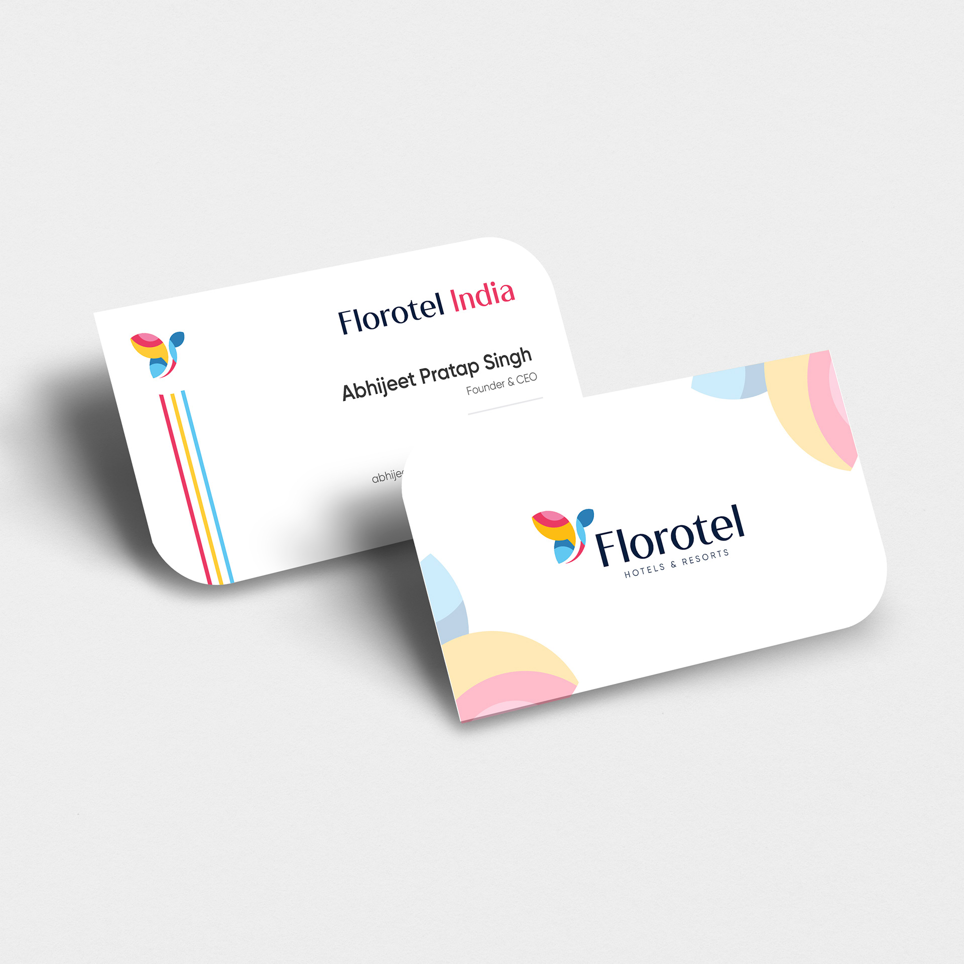
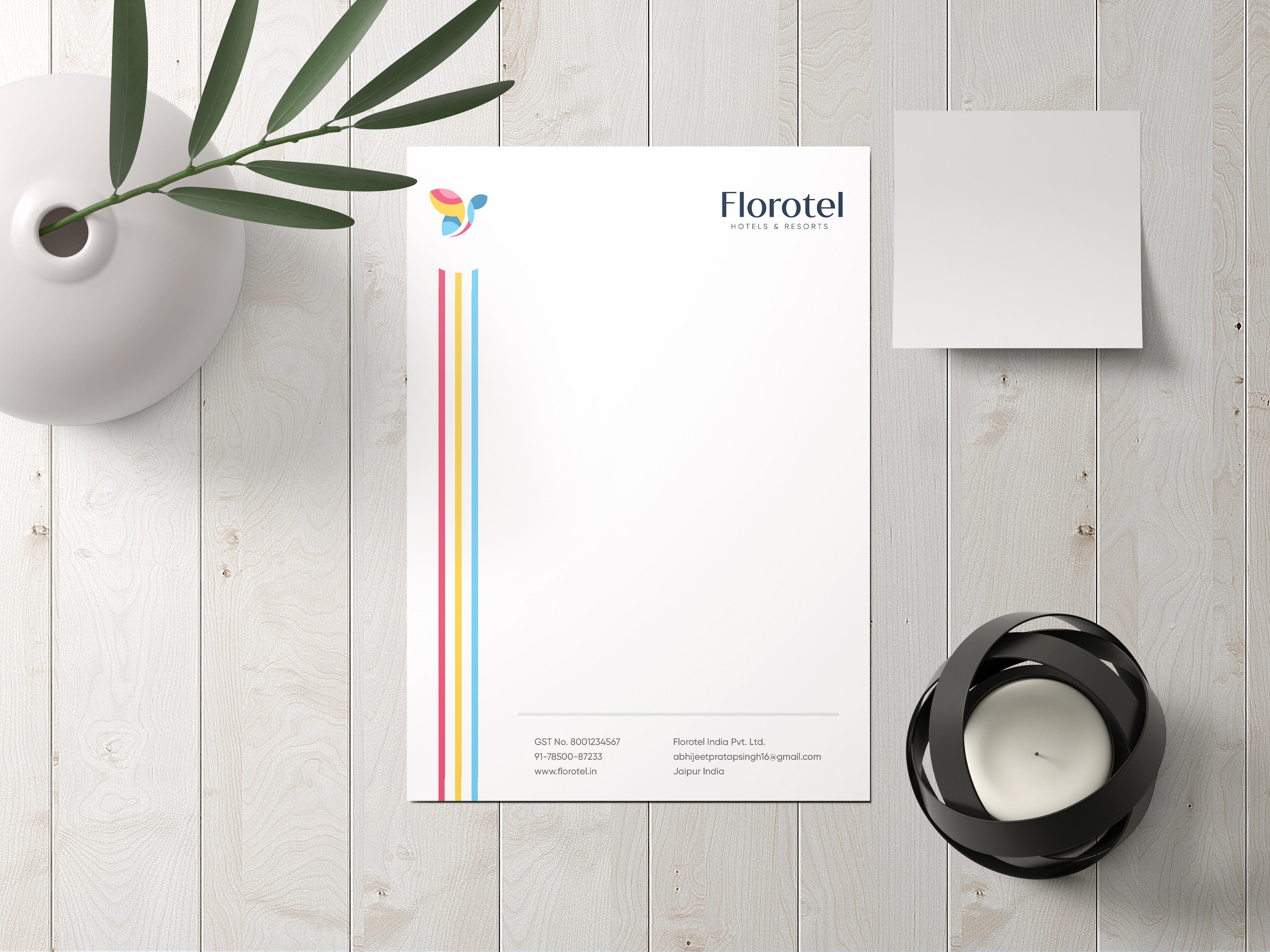
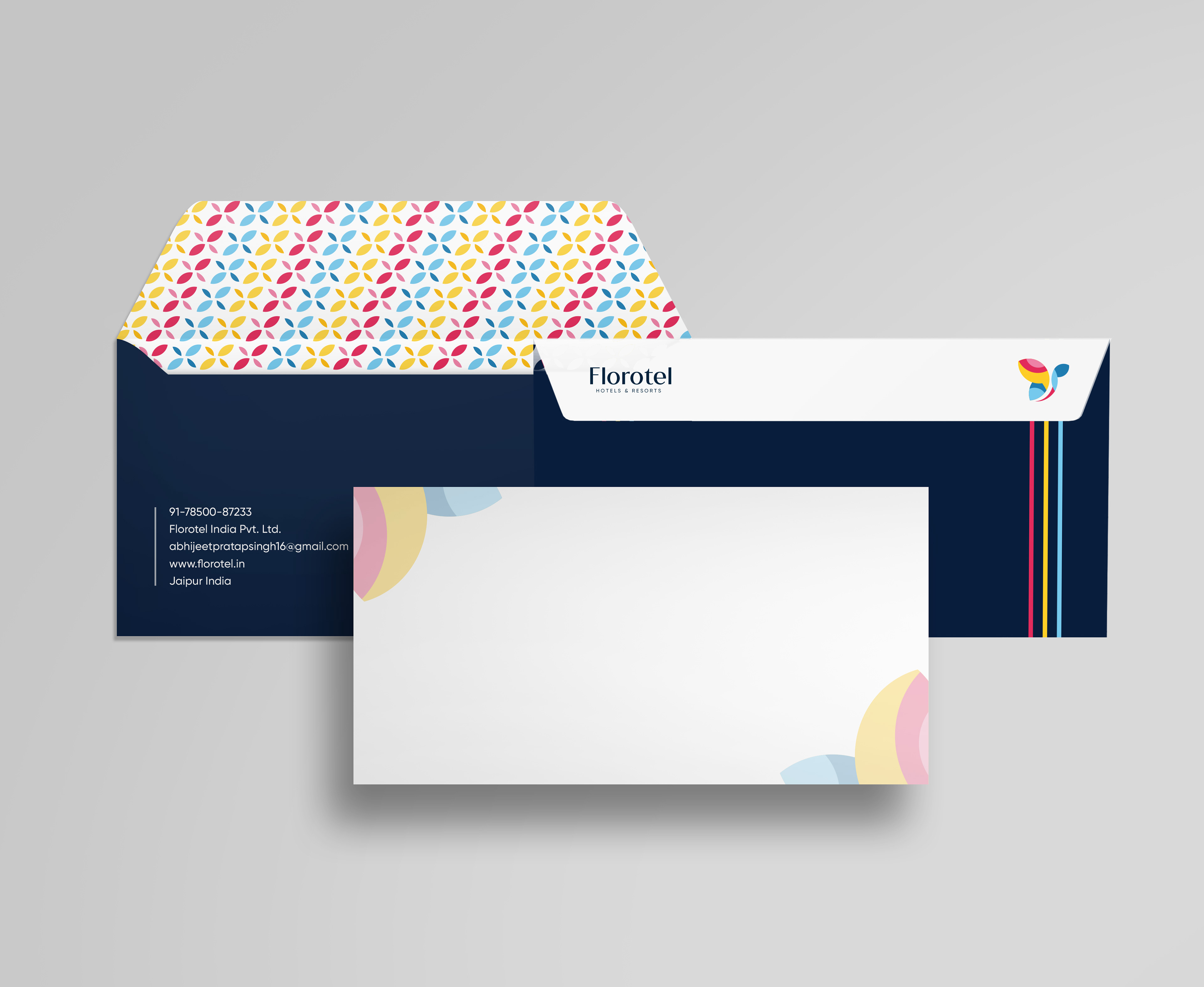
Stationery & Corporate Identity
A professional suite of materials including business cards, letterheads, and envelopes that establishes a strong first impression .
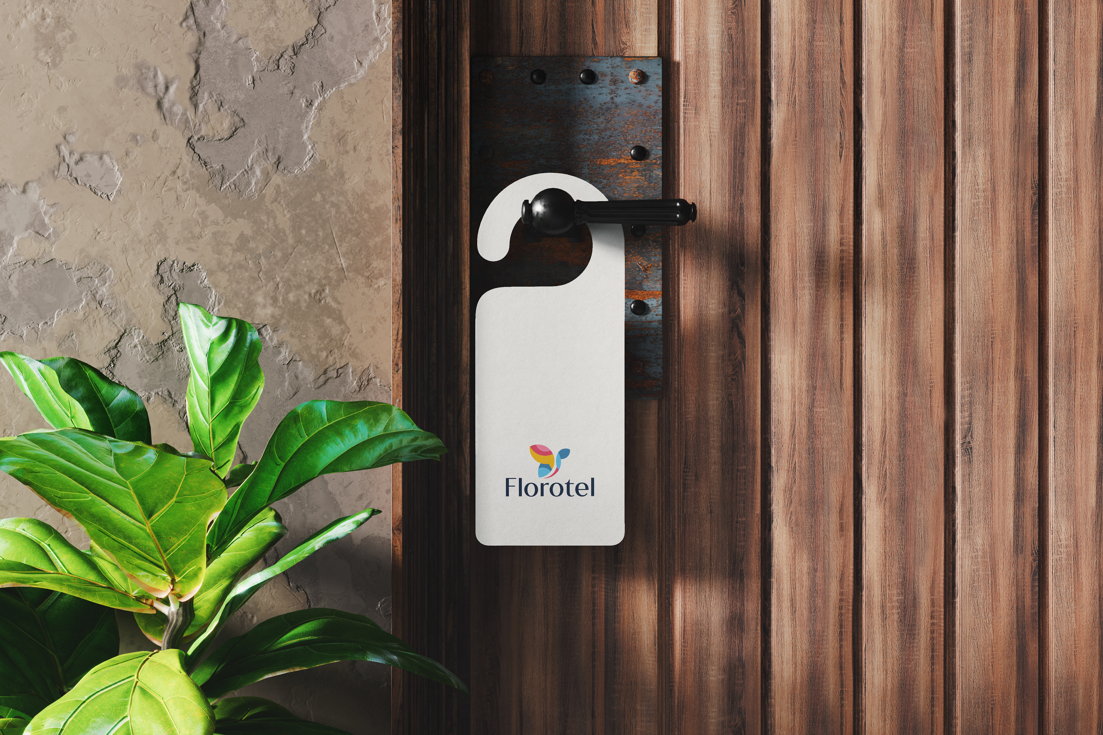
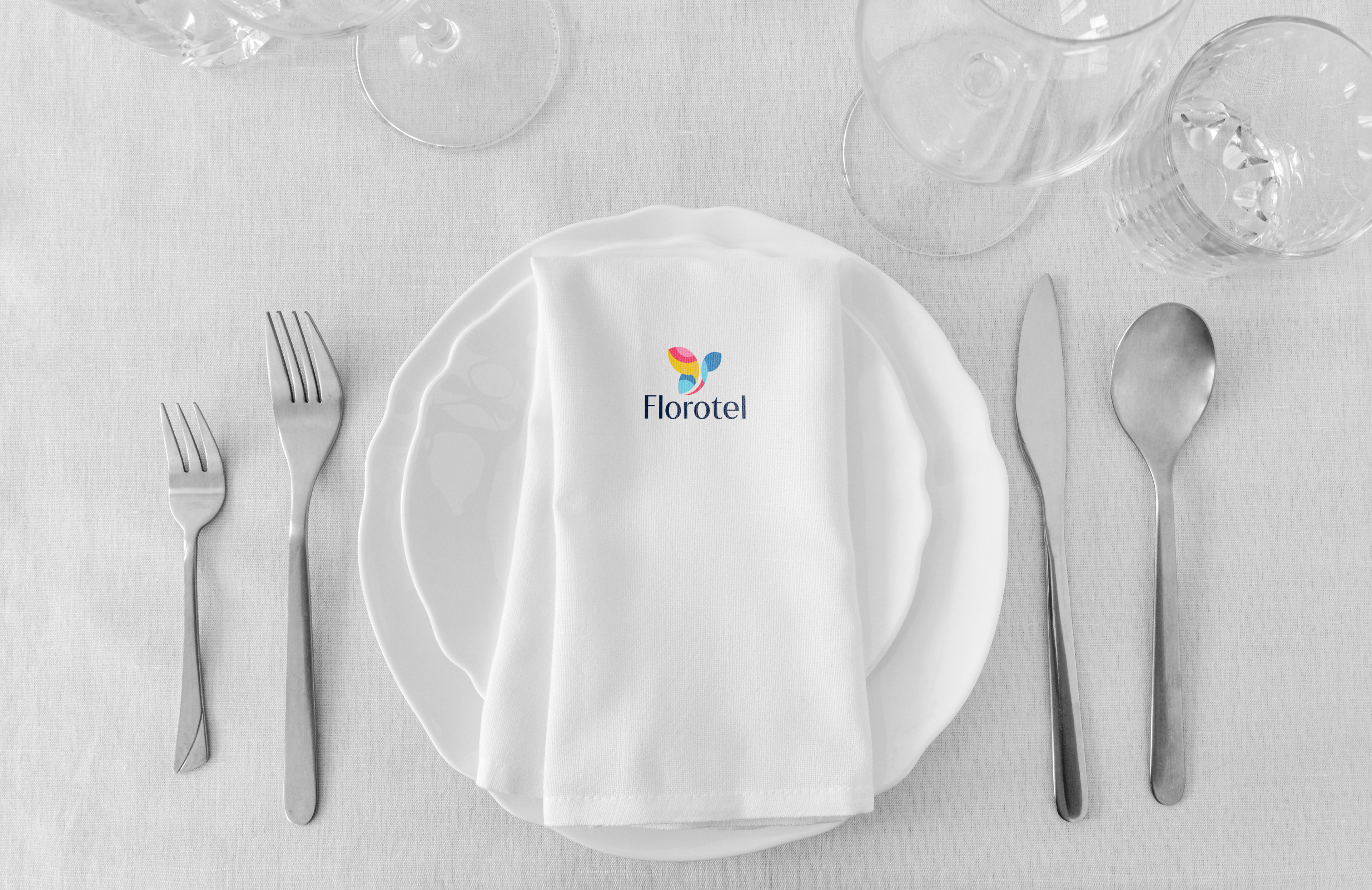
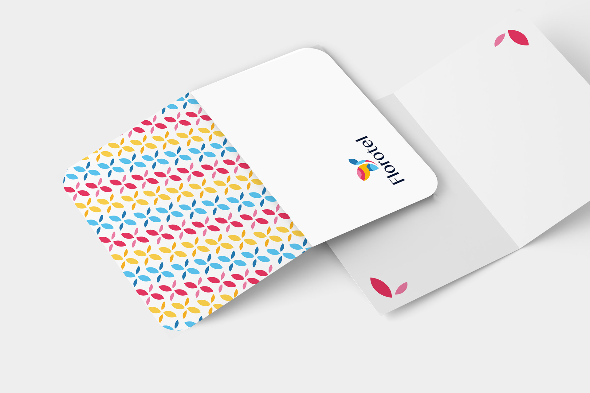
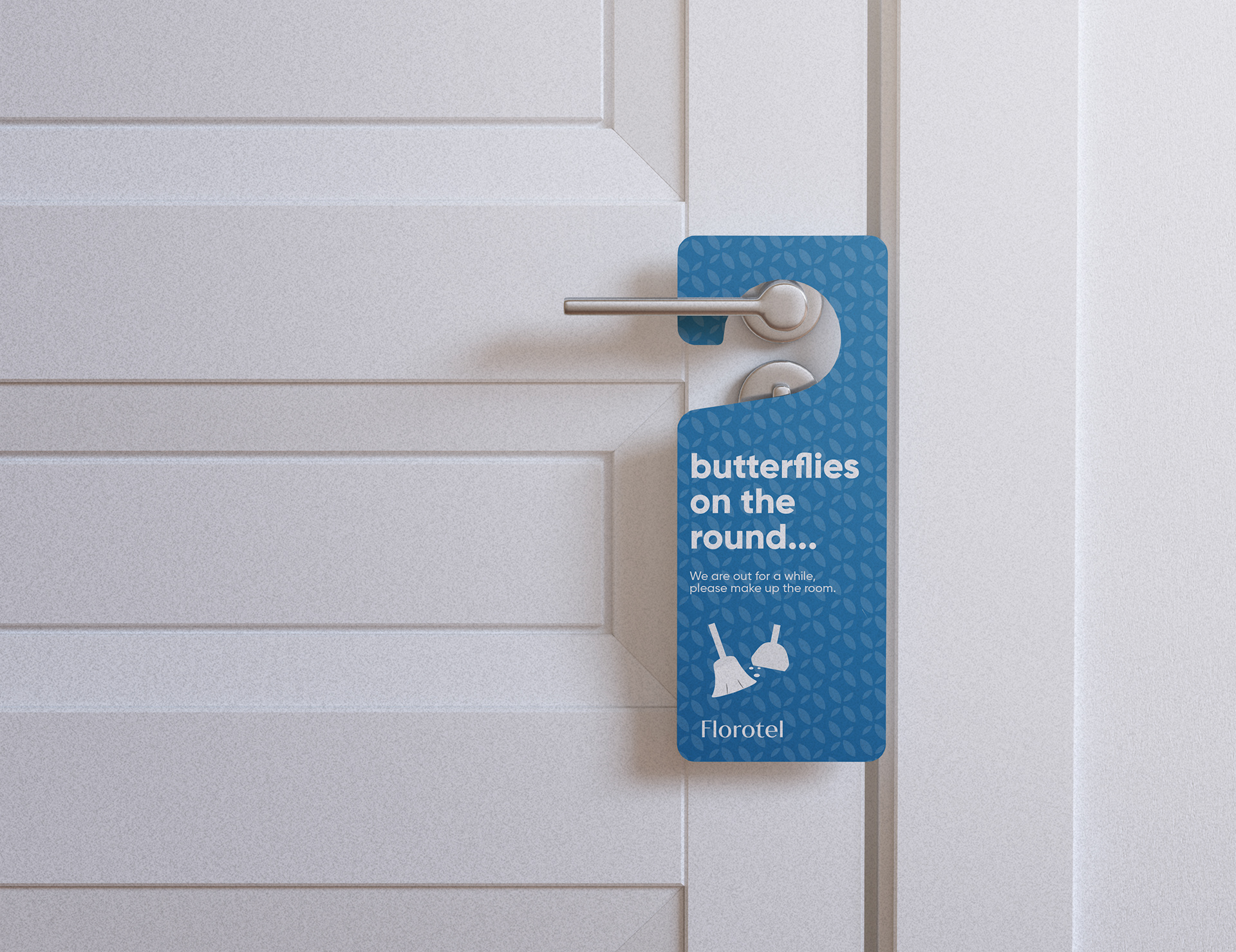
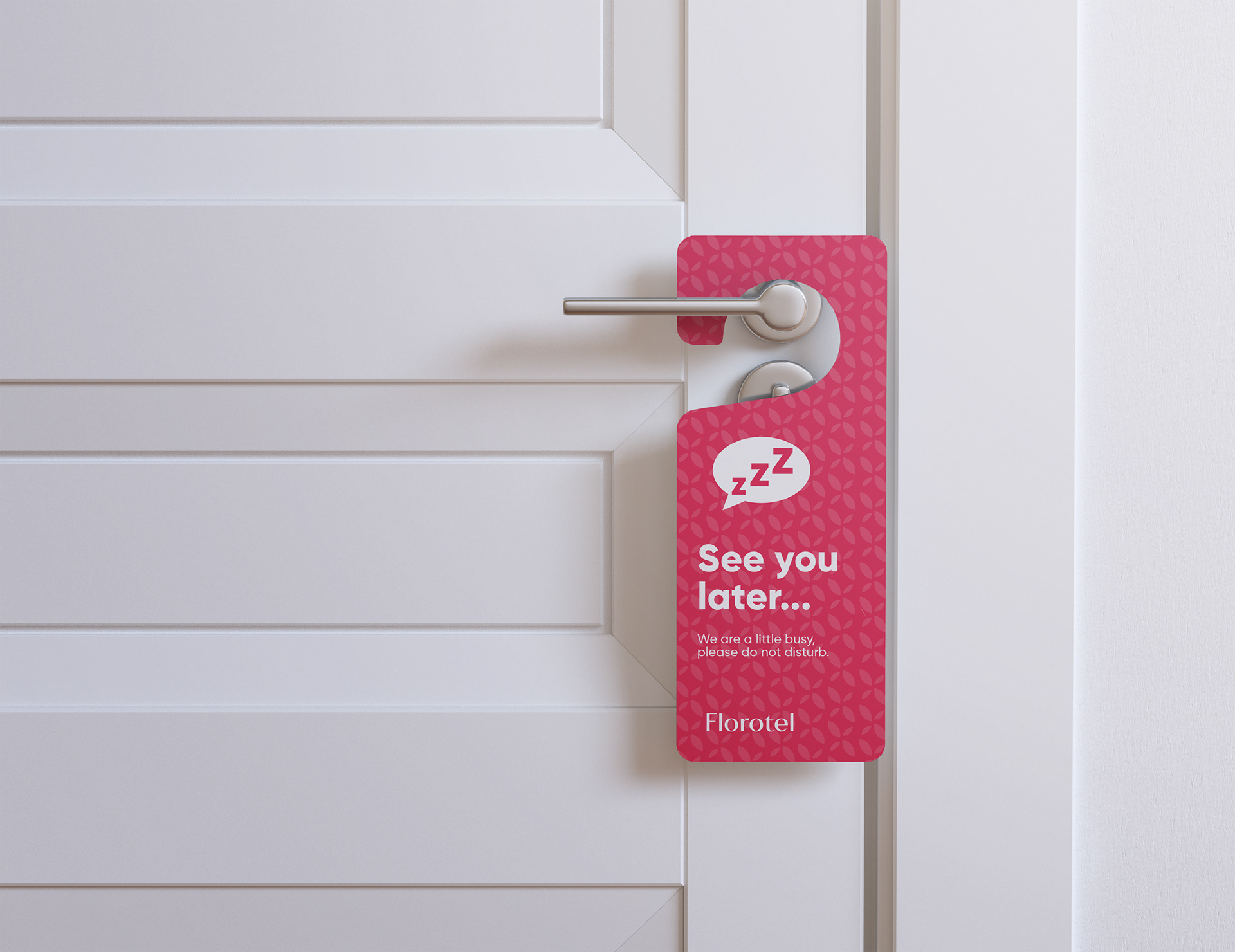
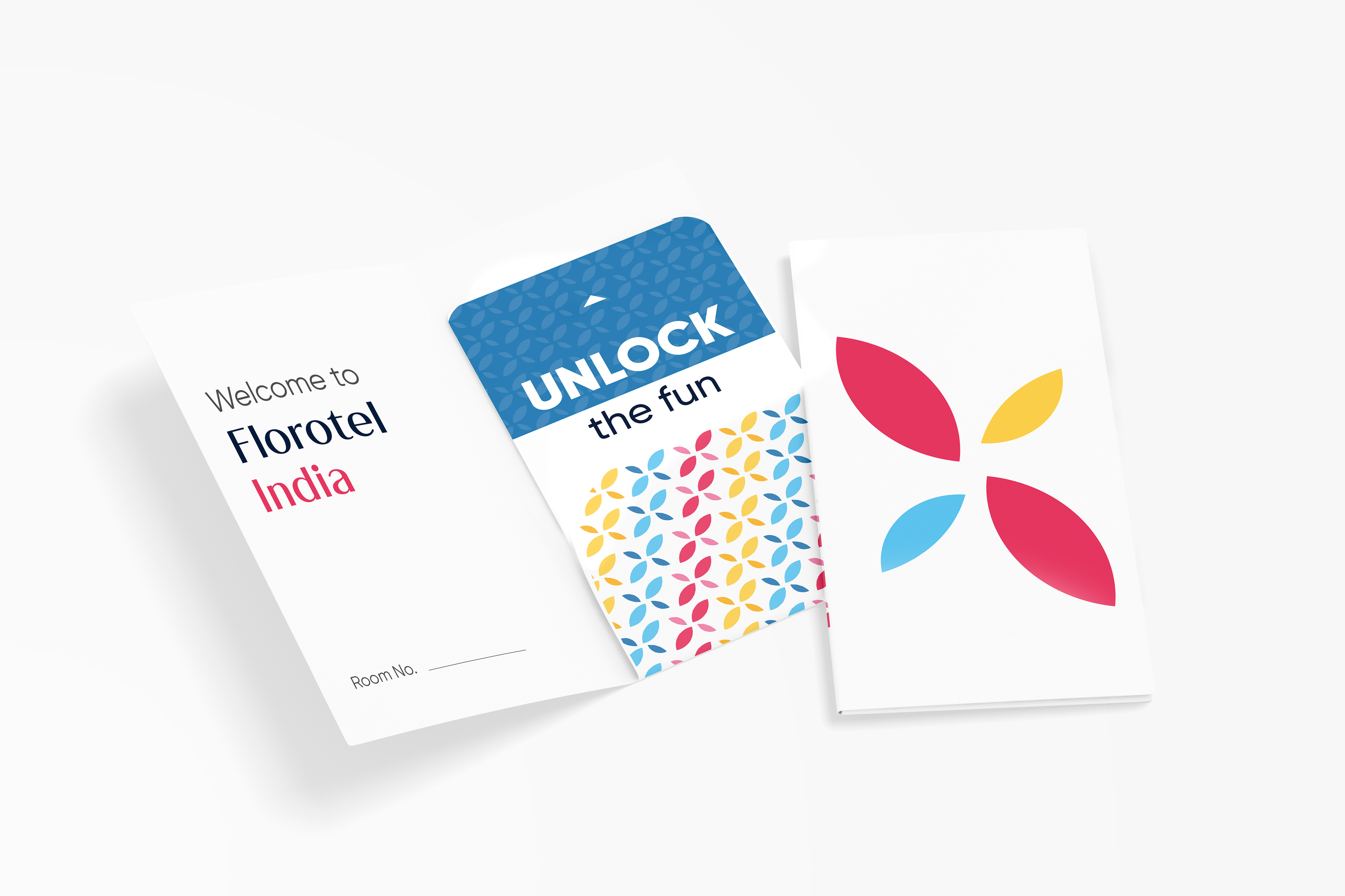
Guest Welcome Experience
Custom-designed welcome cards , key card holders , and playful "Do Not Disturb" door hangers make the guest feel special from the moment they arrive.
In-Room Amenities
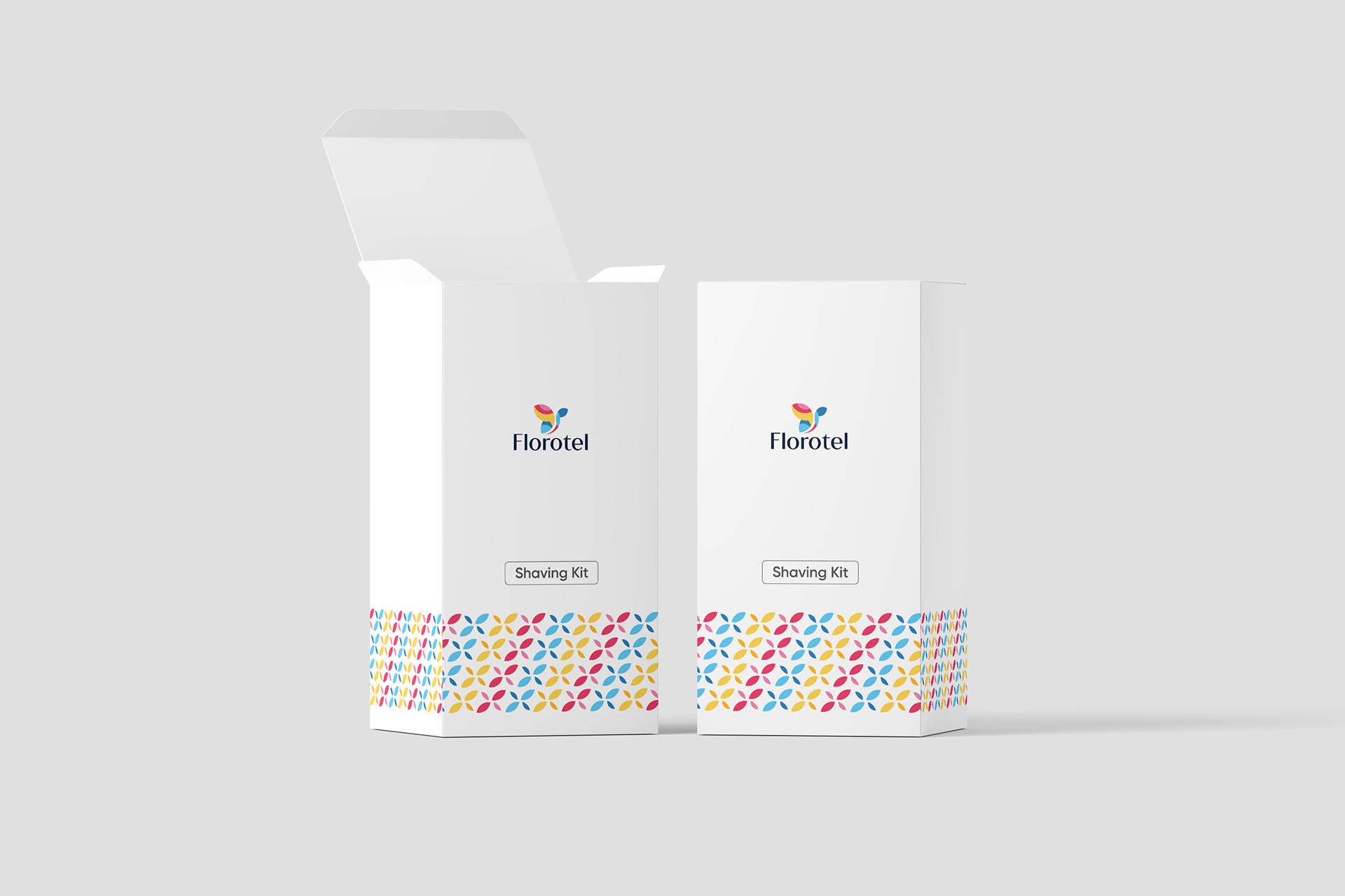
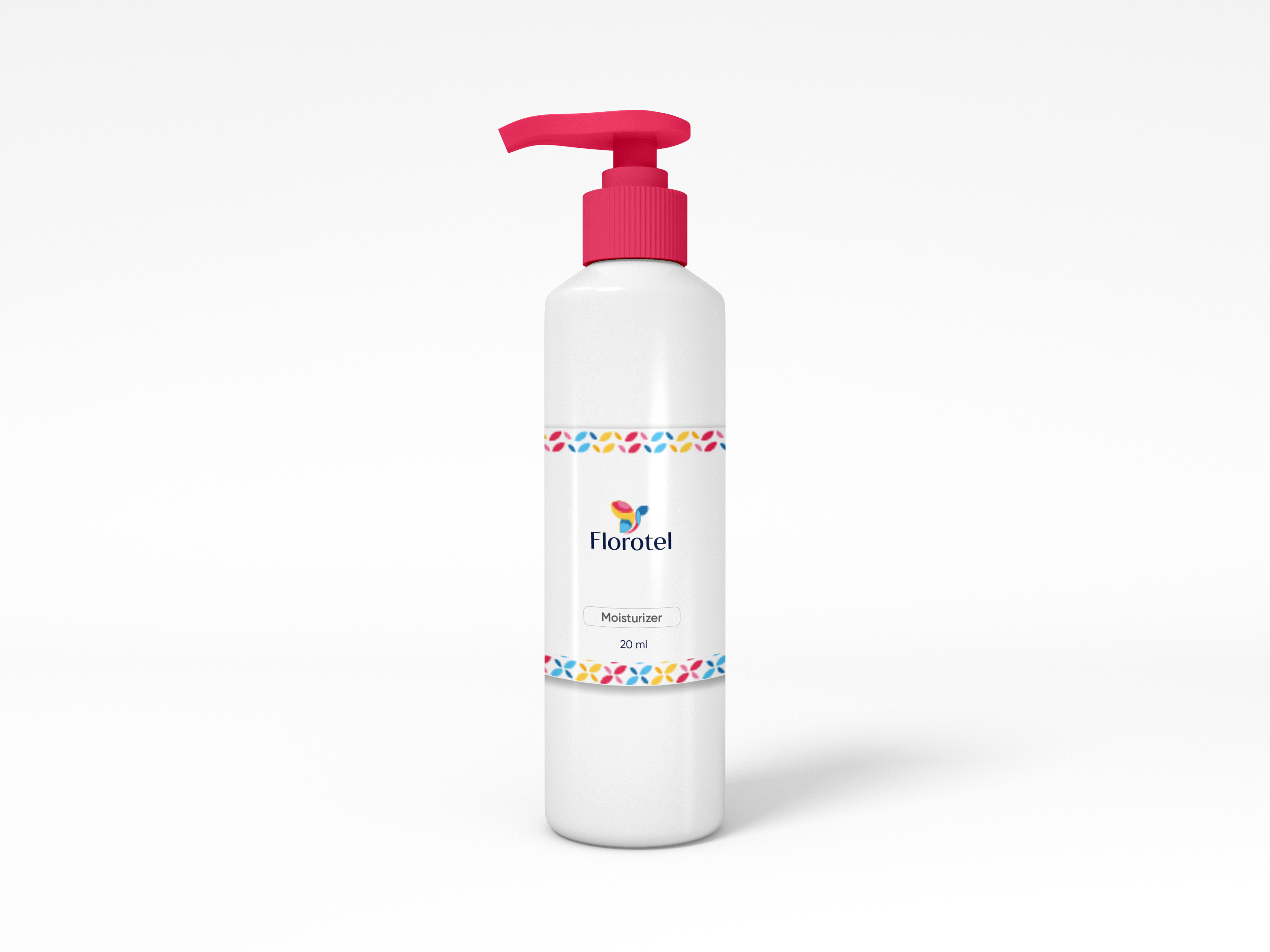
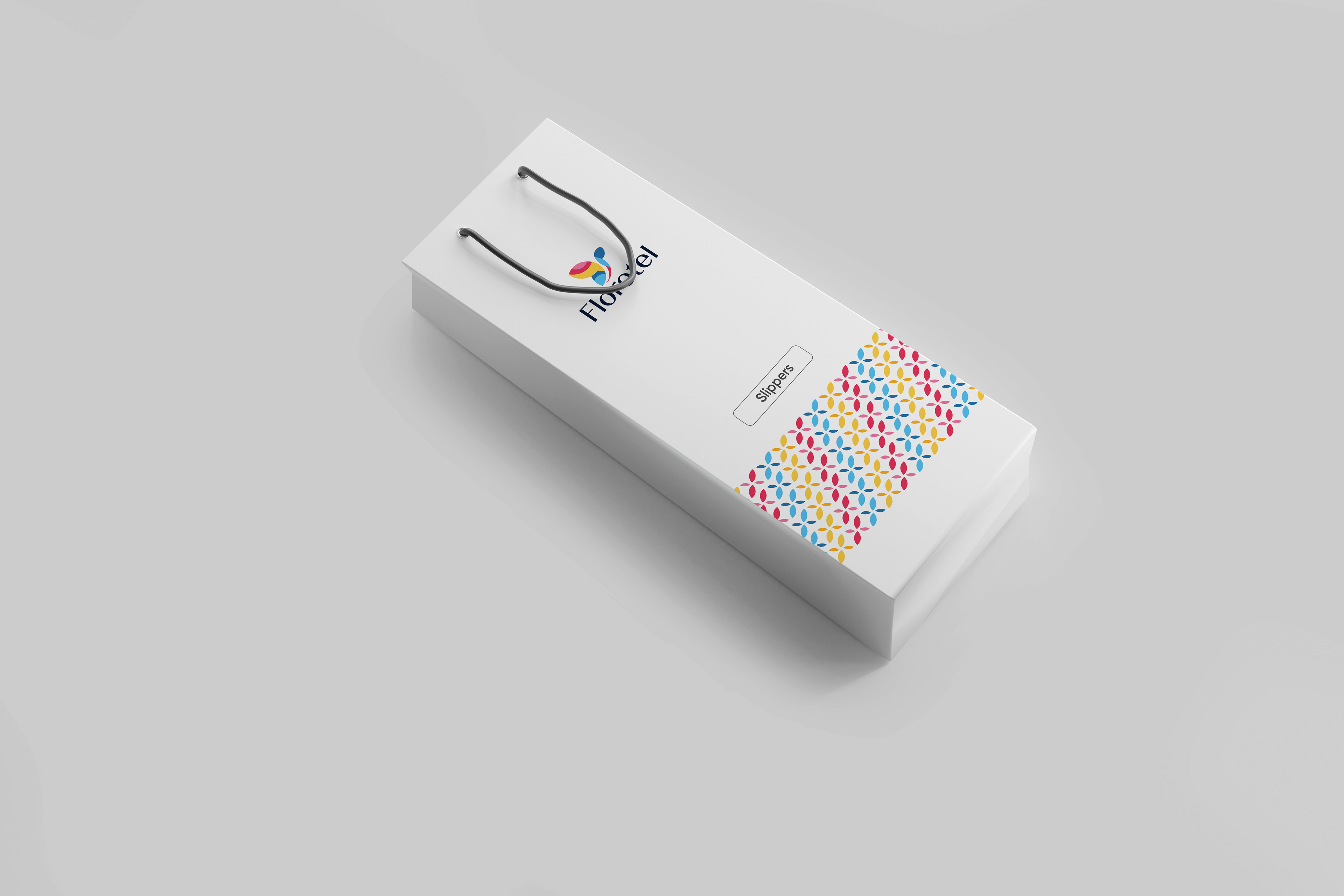
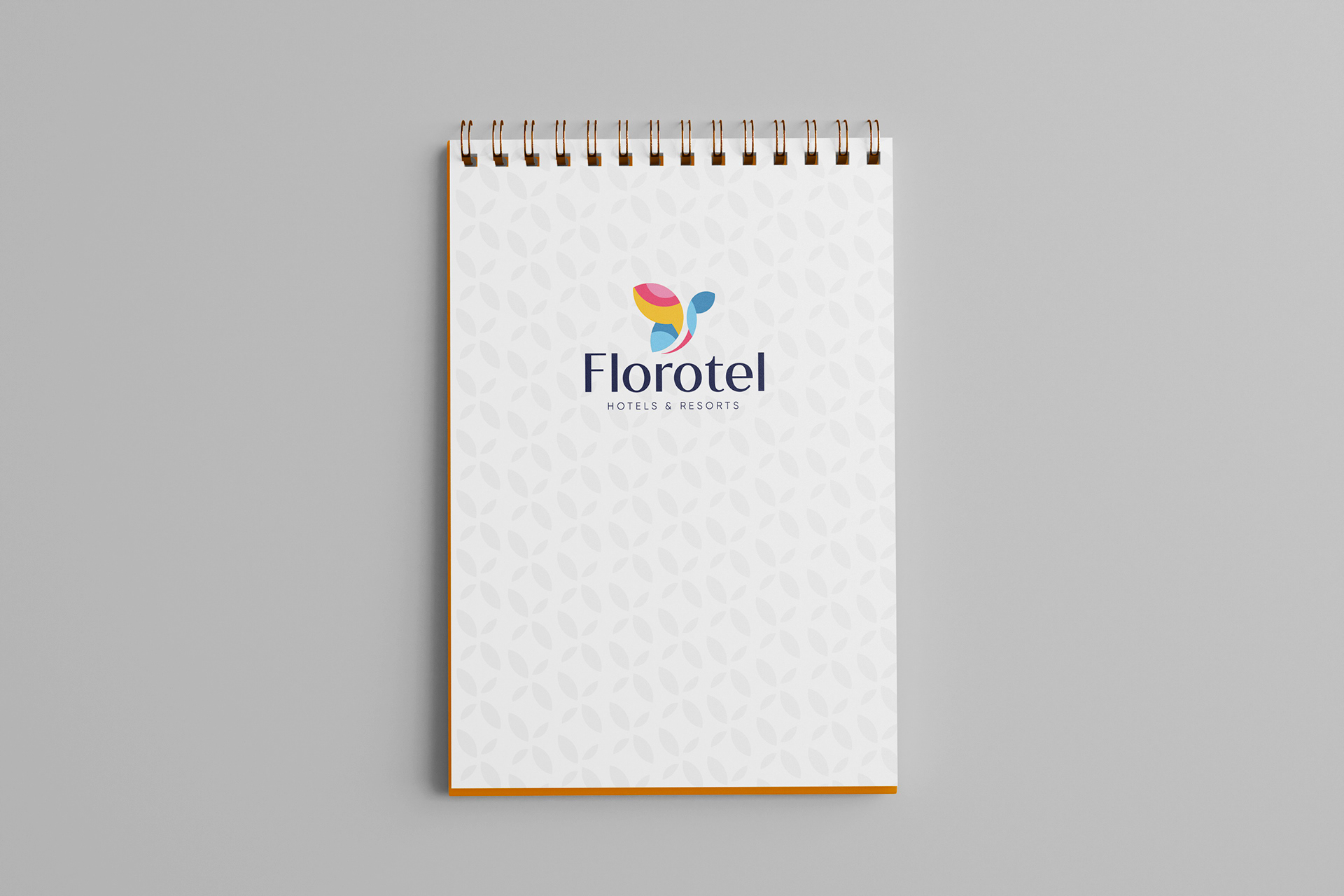
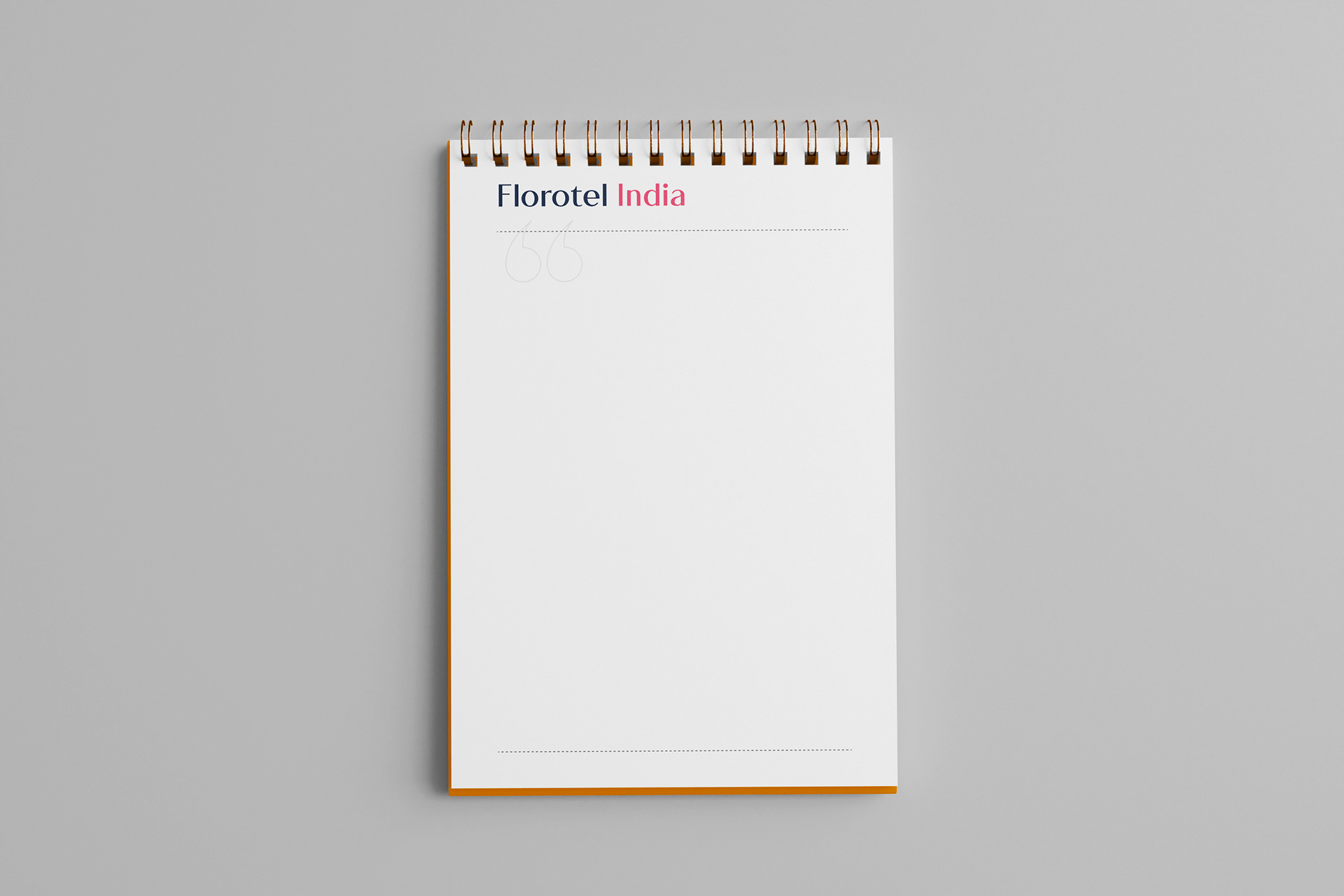
A full range of packaging was designed for in-room items like the dental kit , shaving kit , soap , comb , and writing pads , ensuring a consistent brand experience.
Promotional Materials
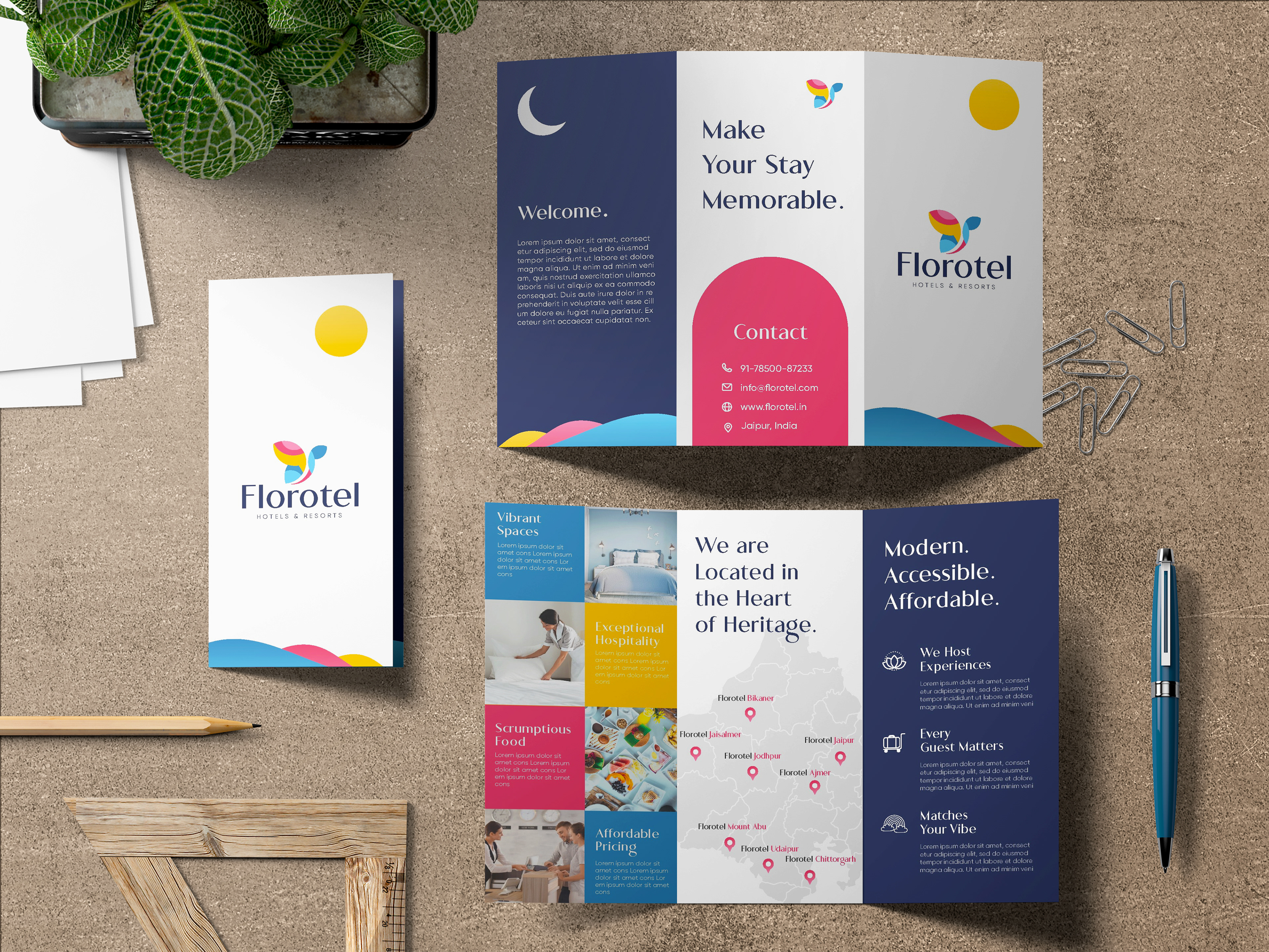
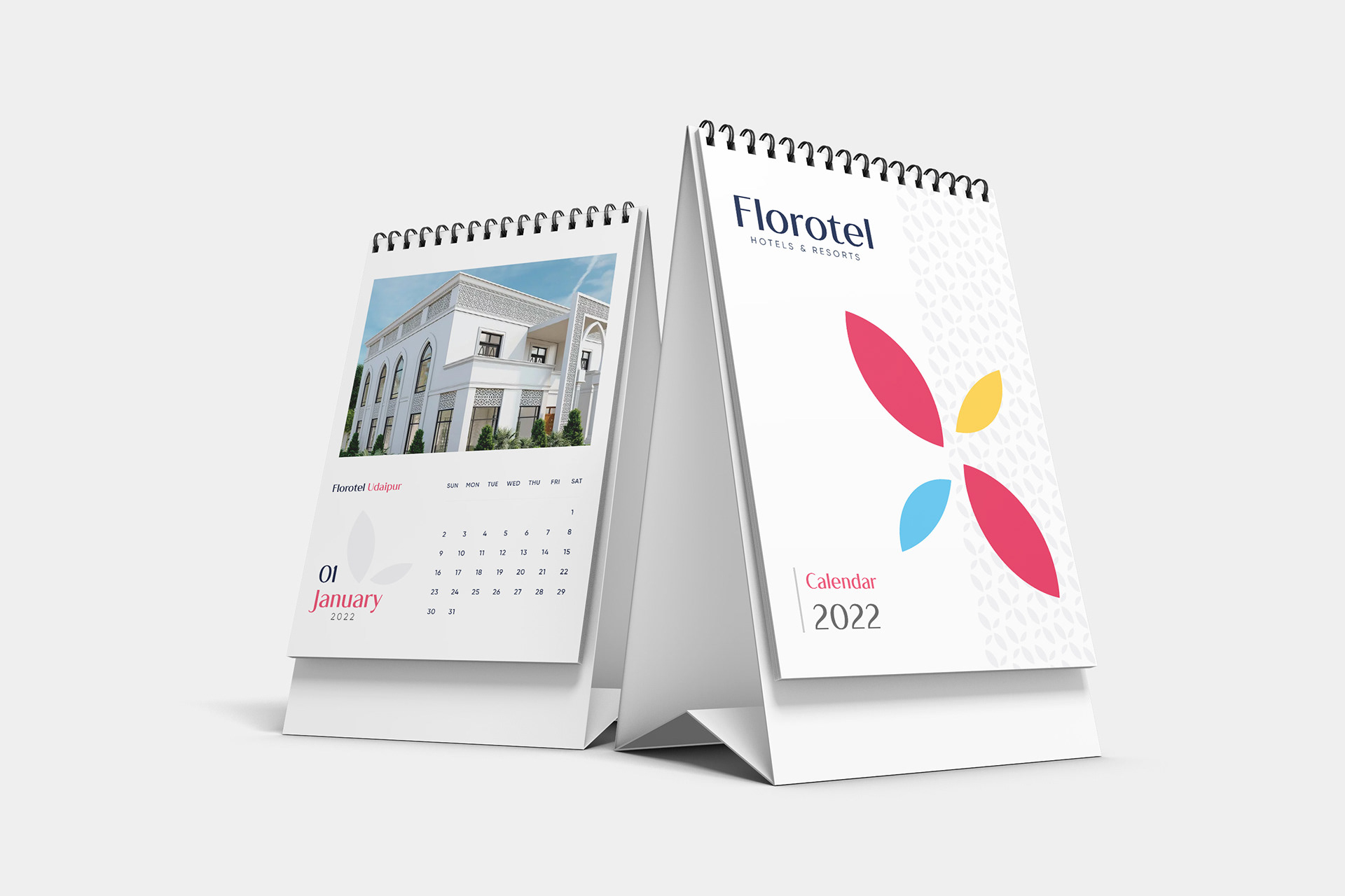
The branding extends to other collateral such as a beautifully designed desk calendar for 2022 and a clean, detailed brochure to reflect the experience at Florotel.
Client
Florotel Hotels & Resorts
Agency
Bluewave Media
My Role
Lead Graphic Designer
Project Scope
Logo Design l Visual Identity System l Promotional Materials
Year
2022
Softwares Used
Adobe Illustrator l Adobe Photoshop